Turning keywords into a co-occurrence network
This note is addressed to the GLM Fall 2016 students who are currently taking my Statistical Reasoning and Quantitative Methods course at Sciences Po in Paris.
Dear students
Since you are going to learn a lot of statistical computing/programming this semester, I thought it would be a good idea to show you a quick example of what you can achieve with those skills if you continue learning them beyond the scope of our course.
The demo below uses a different programming language than the one that you are learning to use: instead of the Stata/Mata language used by the Stata software that we use in class, this post shows you how to use the R language. The R language has a steeper learning curve, but it is also much more versatile than the Stata language.
tl;dr – This note explains how to plot this graph in less than 70 lines of code:
The data: Your keywords
In our second class together, I suggested that you fill in a Google Sheet with your names, and with the keywords that represent your main research interests, as in:
François: Public Policy, Health Systems, Health Inequalities
Taking advantage of the fact that your class is a small one and that there are no duplicates among your first names, I have anonymized the data that you submitted by keeping only those first names to identify you in it.
Furthermore, I have cleaned up your keywords by capitalizing them and by harmonizing them a bit, e.g. coding "Spatial Inequalities" as "Spatial Inequality" everywhere where that combination of keywords appears.
The result is that dataset, which has only two columns, i.e. only two variables (name and keywords), separated by a tab (\t) character:
The data contain 18 rows—a header row, and one row per student. It's a small dataset, but it is also highly representative of your student group, since all of you filled in the table. Still, the sample of students shown here is only a sample from the target population (GLM students in year 2016), because that population might (marginally) vary throughout the academic year.
Going through the data, you will notice that some of your keywords are shorter than those that you submitted: "Community/Neighborhood Initiatives," for instance, has been turned into simply "Community/Neighborhood." This is because we are going to visualize the keywords into a particular kind of plot in which long text strings like that one will be problematic to read.
You will also notice that some keywords have been radically altered: I have replaced "Environmental Initiatives" by "Environment," and "Social Movements" by "Collective Action." This is because I believe those pairs of keywords designate similar things—so the data inevitably contain some interpretation introduced by the coder (myself), and might therefore differ from what is meant to be measured (your interests).
The concept: A network of keyword co-occurrences
From keyword co-occurrences…
Some of the keywords that you provided are very precise, others are more vague. What we are going to do now is to find which keywords are more frequent, and also find out which keywords were cited together in the individual lists that you submitted.
Every time a student mentioned two keywords together in his or her list (i.e. a keyword co-occurrence), we are going to create an undirected tie between those keywords, as in
Gender---Inequality
Inequality---Gender
The undirected nature of the tie means that the two examples above are treated as identical: the direction of the tie is insignificant.
Note that we are going to treat as co-occurrences the situation where two keywords are listed together by a student with a comma between them, as in Gender, Inequality, but also the situation where two keywords appear separated by the "and" conjunction, as in "Gender and Inequality."
This last rule, which is arbitrary, will consequently ignore the "Gender and Race" association that several students included in their list of keywords, and treat it as if the students had listed the keywords separately as "Gender, Race." Data preparation always implies some simplification, which is what is happening here.
… to a network of co-occurrences
The data contain several keywords that appear on more than one row, so the aggregation of all the different ties that we are going to create will produce a list of connections between keywords – which we will call an edge list – in which some ties will appear more than once.
At that stage, if you are familiar with network theory, you should be thinking: this is going to be a weighted one-mode network—weighted because each tie in the edge list will be valued by a positive number that indicates its frequency, and one-mode because the edge list contains only one kind of entity (keywords).
If you are not familiar with network theory, which I assume is the case, just read on, see what happens, and use your intuition to understand what we will be doing.
Back to the data
Let's now introduce our first snippet of R of code, which reads the tab-separated data shown a few paragraphs above, splits it into individual keywords, aggregates and counts those keywords, and orders those that appear more than once into a list ordered by decreasing frequency:
I am not going to explain how the code works in detail, but if you just read through it, you might guess that the first line, read_tsv, is a command – or more exactly, a function – that reads tab-separated (TSV) data.
The same line of the code extracts the keywords column from that data, which is then split by the second line of code everywhere where a comma or the "and" conjunction appear. The next three lines of code (unlist, table and data.frame) are just data manipulation operations that you can skip.
The final lines of code sort the data by decreasing frequency and show those keywords that appear more than once. The full result is shown below:
                    . Freq
1              Gender    8
2          Inequality    6
3           Migration    6
4         Environment    4
5             Poverty    4
6                Race    4
7      Transportation    3
8       Urban Studies    3
9   Collective Action    2
10            Housing    2
11       Human Rights    2
12           Politics    2
13           Religion    2
14 Spatial Inequality    2
The result tells you that most frequent keyword in the data is "Gender," closely followed by "Inequality" and "Migration." The result also tells you that, out of all the keywords that you submitted, 14 of them appear more than once. With slightly different code, we could establish that there are also 20 single-occurring keywords in the data.
Building a weighted edge list
This section is quite technical. Just skip it if you are only interested in the final result.
Let's turn the keyword co-occurrences into a weighted edge list. To do that, we extract your lists of keywords again, which we then turn into a list of all possible combinations between them, collating the final result into a single object:
The code above is quite esoteric: even if you are very familiar with R code, some bits of it might be a bit obscure. Do not focus on the code, and take a look at this extract from the result instead:
                            X1                         X2         w
1                  Development                Development 0.2000000
2                   Corruption                Development 0.2000000
3                  Development                    Housing 0.2000000
.
.
.
222          Collective Action      Immigrant Integration 0.2000000
223          Collective Action          Collective Action 0.2000000
224                Environment                Environment 0.3333333
225          Collective Action                Environment 0.3333333
226                Environment              Urban Studies 0.3333333
The e data object that we have created is a weighted edge list: the first two columns, X1 and X2, are keywords that appear together in your lists, and the last column w is a weighting factor that controls for the total number of keywords $N$ submitted by each student by taking its inverse value $1 / N$.
Note that the X1 and X2 columns contain alphabetically-sorted keywords: the first column always holds a keyword of lower alphabetical order than the one held in the second column. This trick ensures that we will treat the keyword associations $(i, j)$ and $(j, i)$ as the same association, since our edge list contains only undirected ties.
Also note that some rows hold something known as "self-loops," i.e. keywords that are "connected to themselves." In this precise context, these loops are meaningless and will be dropped at the end of our next step:
This bit of the code aggregates all ties together by summing their weights, so that every unique association of keywords $(X1, X2)$ now has the weight $W_{X1, X2} = \sum{1 / N}$, where the $1 / N$ fraction designates the value that we previously established as the weighting factor of a single edge, or tie between keywords $X1$ and $X2$.
I call the result of this weighting technique "Newman-Fowler weights" in reference to two scientists, one physicist and one political scientist, who used it in a series of papers on scientific collaboration and legislative cosponsorship respectively.
See my note on weighting co-authorship networks for more details on the kind of edge weights that I am using here.
Building a weighted network
This section is also quite technical. Just skip it if you are only interested in the final result.
The next part of the R code is even more esoteric than the previous parts of the code, because we are now going to turn the edge list e into the undirected network n, which will contain keywords connected by ties indicating when these keywords were listed together:
The code above has also weighted the network edges (i.e. its ties), and used these edge weights to compute the weighted degree of each vertex (or node) of the network, using a formula by Tore Opsahl, a scientist who currently works at the Bank of America.
"Weighted degree" stands for a network measure that reflects the centrality of the nodes in a network. In our co-occurrence network of keywords, those keywords that are connected to many other keywords will have a higher degree, which will be useful to visualize the keywords that were frequently listed.
Since we are using a weighted degree measure, the fact some students listed more keywords than others is controlled for by the $1/N$ inverse-sum factor that we described above. The weighting method that we are using is not perfect, but it is good enough for our exploratory purposes.
Visualizing the network
We are now only two steps from the final result. The last technical step that I want to take is to label only the most important keywords of the network, in order to avoid having too much information in my final plot. I will do this by hiding keywords with a low weighted degree:
And finally, let's plot the network using the ggplot2 "grammar of graphics" syntax, in combination with some code that I wrote to have this syntax work with network objects like the one that I built in the previous parts of the text:
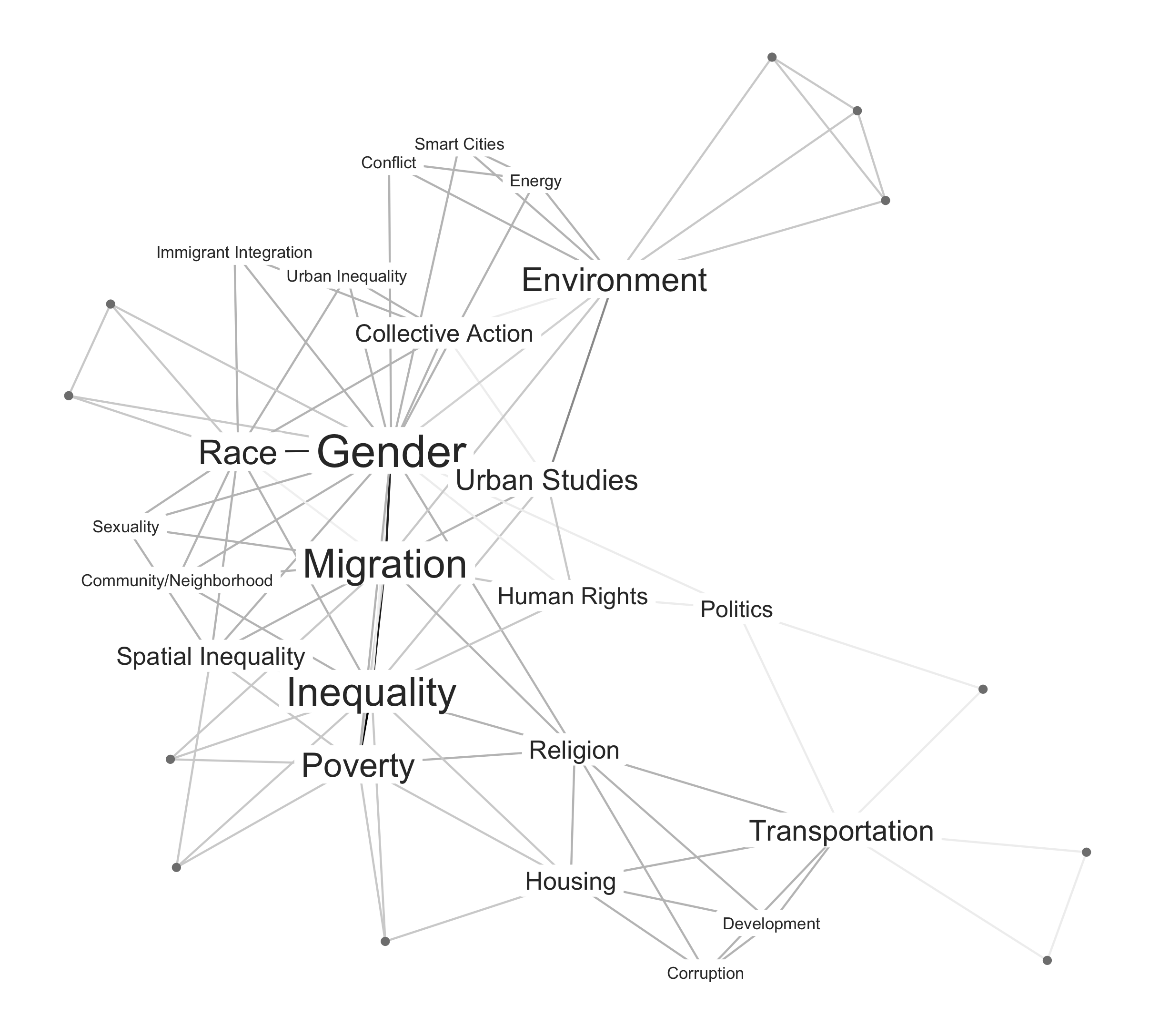
Here's the result, which is also shown at the top of this note. The network is composed of nodes (keywords), connected by ties (co-occurrences). The placement of the nodes was obtained from a force-directed placement algorithm that attracts nodes with strong ties and repulses those with no ties.
In the plot, nodes with higher degrees have larger labels, and the strongest ties between the nodes are darker than other ties. The nodes represented as points instead of labels are keywords with low weighted degree values. These nodes, which are not central to the network, are logically located at the periphery of the graph.
Final comments
Looking at this graph, what can we say substantively about the research interests of this year's batch of GLM students?
It seems clear that the main thematic nexus in the network is composed of "Race and Gender" combined to "Migration, Inequality and Poverty." In the students' minds, "Inequality" probably equates to "Economic Inequality," as other kinds of inequalities appear as different, better-specified keywords.
The top of the graph also shows a cluster of keywords connected to the "Environment" keyword, and the bottom of the graph shows another cluster connected to the "Transport" keyword, oddly connected to the more central keywords by the "Religion" keyword, which acts as a partial bridge here.
From a substantive point of view, I would say that this graph shows a very surprising disconnect between environmental and transportation issues: both issues are often very tightly connected in real life, especially in urban settings where public transportation is generally promoted as a way to reduce airborne pollution.
The code shown in this not is provided in full in this Gist. If you want to replicate the plot above, you will need to download the data and (install and) load the required packages first.
Update (September 17, 2016): if you enjoyed this note, you might also enjoy its follow-up, in which the same data are used to produce different types of networks.
- First published on September 10th, 2016